ADVERTISEMENT

Avant Garde + Marilyn Monroe = Sexy

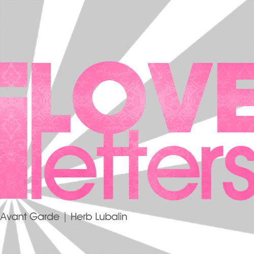
A wallpaper in my flickr wallpapers gallery, double click to go there.

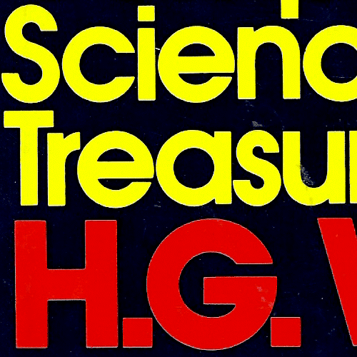
"The Complete Science Fiction Treasury," H.G. Wells, thank sis! Click for full
My predilection for Herb Lubalin's typeface, Avant Garde has been dominating my creations as of late. I end up using it in virtually everything, nothing else seems to work. The use of Avant Garde font on in this blog for example, speaks volumes to my penchant for the design. Prior to this, I had never and would never consider using Avant Garde as a web font. I typically find the use of Avant Garde or even Century Gothic as web fonts amateur and pretentious.
But since the state of fonts on the web is dismal regardless the font you chose, using an 'Avant Garde-Century Gothic-sans-serif' CSS font-stack is as good as any other font-stack, right?
I'm pretty sure though, if I had to name a definitive favorite typeface, it would be Avant Garde. I'd prefer not to think of type in definitive terms, however; for reasons I myself can't quite explain, I love letters. I'd be hard pressed to find a letter I didn't like or felt there wasn't a need for. So much so, that I wouldn't even discount Comic Sans as being a worthwhile typeface. It has it's place. [On the list of fonts I would never, ever use]


2 comments:
I personally love nice thick fonts and Avant Garde just proves how simplicity and boldness looks together. It's just one of those fonts that works wonders with almost every creation, much like Georgia. :P
Oh yeah, I'll be adding your link soon as well!
Cool beans!
Post a Comment
Comments are moderated