ADVERTISEMENT
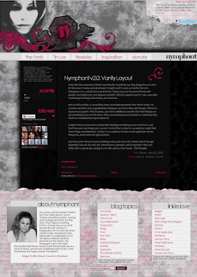
 Well, this time I mean it, I think I have finally completely my blog design for now. Save for the minor tweaks and adjustments I might need to make as I see fit, this is it. Nymphont v2.0, which I have entitled the "Vanity Layout," because of the header graphic that depicts my own likeness (top left). Which I suppose is pretty vain, especially considering this blog is about fonts, not about me.
 But it's still my blog. A casual blog where one might encounter "four letter words," on occasion and other such unprofessional dialogues. As I have often said though, "there's no shame in my game". Which means, I am that confident in myself, that these things are not something I am worried about. They are intentional, not mistakes or something that I had not considered the repercussions of.
I might write on here about accidentally deleting everything on my hard drive, and that's because I am being real. I am not worried that a client or an employer might find these things unprofessional. A client or an employer of mine would appreciate me for being real, relate-able and approachable.
Anywho, here's the new layout. Nothing crazy, just some CSS. I think I like it though. Hopefully I am not the only one. Please leave a comment and let me know what you think. Have a great day, and give your life a listen. Stay tuned, ~The Nymph
 Another Re-Design
 The Nymphont Winged Coffin Logo
 The Fonts
 The Header Graphic Obsession
2 comments:
I like the header atm :)
It looked better live lol I swear. Yeah... I suppose you are right, this design is a big improvement... but theres still something about this old design I really like. Anywho, thanks for stopping by and for the comment :) Have a great day.
Post a Comment
Comments are moderated